|  | Welcome to guidebook, a website dedicated to preserving and showcasing Graphical User Interfaces, as well as various materials related to them.
|  |
| |
| | Site last updated on 6th October 2006:
| |
| |
| | New set of posters with mouse pointers:
|  |  |
| |
| |
| | Windows XP icons were created in part by the design studio at IconFactory.  Unfortunately, the team was not hired to redo all the icons, hence many inconsistencies between them. Unfortunately, the team was not hired to redo all the icons, hence many inconsistencies between them. |
| |
| |
|
| | 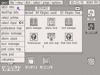 | Graphical Environment Operating System for Commodore C64 was one of the first, if not the first GUI the author of this website has become fascinated with. GEOS tried to recreate Macintosh interface on a vastly inferior machine, and even if it was slower and more limited, it prolonged the life of a dying 8-bit platform.
 |
| |
| |
| |  | The infamous Dock in Mac OS X is a feature that you can either love or hate. Having its roots in NeXTSTEP, Dock features much more eye candy, while trying to combine the functions of both application launcher and switcher.
 |
| |
| |
| |  | For one of the most popular 3D modelling and rendering applications, 3ds max’s (or: 3D Studio Max’s) splash screens seem very insipid and uninspiring, maybe with one small exception. Find out which one.
 |
| |
| |
|